Monday, December 23, 2013
Tuesday, November 12, 2013
Bunny Had A Birthday

My sweet little Bunny turned two! I can hardly believe it! You hear "where has the time gone" time and time again, but seriously, where has the time gone?! She is such a blessing to us and I really can't imagine my world without my girl. She is such a delightful child and it brings me to tears if I think too much about how much I love her.
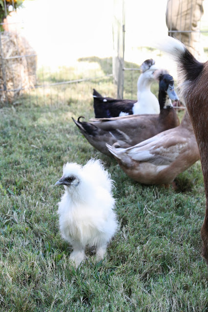
We threw her a fun little party to celebrate. Since it is kind of design related, (I like to see party décor, so I thought you might like to as well) I thought I'd do a little blog post. I kept the colors the same as last year so that I could reuse her decorations. I changed it up just a bit so that it would feel like a small town county fair, animals and all :-)


I wish I could just bottle these memories up so that I could pull them out and remember them just the way they were. It was a really great day! If this next year is even a smidgen as fun as the last, we are in for quite a fun ride :-)

Wednesday, October 16, 2013
1920's Renovation | The Master Closet

Historic restoration is one of my very favorite types of design. I particularly love the architecture and finishes from the 1920's, so this project has been such a joy to work on from the beginning. If you are new around here and are interested in seeing more of this amazing home you can check out some of the other spaces I've previously blogged about like the Solarium, the Master Bedroom, the Master Bath, the Dining Room, the Stairwell, the Bar, Samantha's Bedroom, and the Playroom Bath.
I still have lots more to show from this home! As with any restoration, especially from this period and with this scope of work, nothing is ever quick but it is so worth it if you take the time and have the patience to see it through. I've loved every inch of how this home has been rejuvenated and how she still respects the integrity of her architectural roots.
So, now I bring you the incredible master closet. This is the 3rd space to a 5 space master suite, as you can see in the footprint below.
As you may have seen in the previous post about the master bath, we combined an unnecessary guest room and bath into the space that would become the new master bath and closet.


In the 'before' image below, you can see the space we started with. The adjoining bathroom is in the master bath post below if you are interested. All of the windows remained in the same locations.

Here is the 'after' from as close to the same angle as I could possibly get with the new wall locations.
Stunning right?! I designed all the custom cabinetry units to extend to the ceiling to maximize storage. Behind all of the doors, at the base of the cabinets, are drawers for foldable items etc. We added those little baskets for some texture to soften the hard millwork lines. One for laundry and one for dry cleaning.

Here is another 'before' image.

This is the 'after' from the same angle. The headboard in this image sat where the row of cabinets are on the right. The shoe shelving and handbag area are actually recessed past where the previous wall was.

We also installed interior cabinetry lighting. This feature is gorgeous at night!!!


Obviously I'm having a difficult time finding the time to blog but hopefully I'll be back to a more consistent pace soon. I'm thinking about bringing back the 'What I'm Loving Wednesdays' series...
I hope you're having a great week!

Monday, August 12, 2013
1920's Renovation | The Master Bath

Finally, the stunning master bath of my 1920's restoration project! This project has been complete for well over a year but I couldn't quite find the time to photograph it. Alas, here she is.
This bath project is basically my dream bath! My clients let me build my dream bath in their house... at least that's what I tell myself :-)
Sigh...maybe someday...
So here is a little refresher of what we started with in floorplan view. If you haven't already seen the master bedroom and are interested check it out here.

So, as you can see in the floorplan view, I took a spare bedroom and bath that they didn't need and transformed that space into the new master bath and closet. I'll have to save the closet for another post because there is just too much going on here to talk about it all at once.
We closed off the hallway and made the new entrance to the master suite through the former master closet. In the 'before' image below you can see the old hallway leading to the old spare bedroom and bath. The new entrance to the suite was built right where that black console sits on the left.


In this 'before' image you can see the former bath in all of it's ballet pink tiled glory.

From the same angle below, you can see the new make-up vanity for the lady of the house. The toilet and shower plumbing actually stayed in the same location, but a watercloset was built around the toilet for privacy.

The new his and hers vanities...

The gorgeous Kohler Vintage freestanding tub nestles perfectly into the corner between the vanities. It creates beautiful focal point when you walk into the bathroom.

The freestanding bathtub complete with a vintage inspired chandy overhead, by Visual Comfort & Co.

I specifically selected the vintage botanicals and their gold leaf frames to complement the Honey Onyx and the gold veins in the Calcutta marble. Can we go ahead and talk about that Calcutta and Honey Onyx basketweave?!...good grief, I love it so very much!!!

Looking back at the master bedroom and the entrance to the closet on the right (more on the closet later).

The bank of cabinets is where the old hallway on the plan is, for your reference. I designed lots of linen storage and a full length cabinet tucked to the left (not visible from this angle) was designed to hang robes out of sight.


The new shower is amazing!!! It is decked out with dueling shower heads that have their own settings. The settings stay fixed to the setter's preferred temp so, when he or she takes their shower all they have to do is turn on their side and there is no need to adjust to get everything just right.
A rain shower head hangs above on a different valve.
I carried more of the Calcutta Gold into the shower in a classic herringbone pattern with the Honey Onyx and Calcutta basketweave on the shower floor.

In the 'before' image above, you can see more of the old bath and what will become the watercloset seen below. To the right, you can see the old shower (which stayed in the same location).


If you would like to see more of this project, I've previously blogged about The Solarium, Dining room, the Bar, the Playroom bath, their Daughter's bedroom, and the stairs makeover.
I hope that you have enjoyed the summer. We sure have! It has been such a treat to get lots of summer activities and playtime in with my little bunny!
It is right about this time, in the thick of the Texas summer heat, that I start longing for the chill of fall. I'm pretty sure I'm not alone on this :-) If you follow me on Pinterest, don't be surprised if you see an unusual amount of pins containing images of sweaters, boots and pumpkin pies.
Have a great week!

Subscribe to:
Comments (Atom)


