I recently gave you a little
sneak peek of this project and am now ready to show you the living portion of it. As you can see in the before image above, the space was basically a blank canvas. My clients didn't know where to start in the space and in turn the space became a resting place for unmatched furniture and no commitments on the walls. Here is the space today after I got my hands on it...

Not only was the furniture mismatched before, the scale was wrong for the height of the room. We placed a large distressed cabinet on the largest wall to fill in the huge void that was there before. Not only is it proportional to the space, it also provides storage for books and family photos. I flanked the sides of the cabinet with vintage garden prints that I found at a gallery in Manhattan and had custom framed. The historic green is echoed in the silk sofa pillows.

In the before image, you can see another angle and a little more of the space.
We added plenty of seating, that is not only proportional to the space but really comfortable as well. My clients actually sit in this room now. You catch a glimpse of the dining room in the below image. We did that space along with the living but the lanterns over the dining table weren't hung yet and there were a few final touches yet to be installed.

We used an inexpensive
seagrass underfoot and layered it with a zebra pattern dyed cow hide. This creates interest and a bold graphic for the room...plus, the hide is super soft under bare feet. This is one of my favorite flooring treatments.
In the before image below, you can see how
grand the scale of the room is. The ceilings are really tall and so is the window. This calls for custom drapery treatments to achieve the appropriate height.

I took the drapery panels almost to the ceiling which is dramatic and softens the hard lines of the wall and the plantation shutters.
Another image of the comfy new chairs and the vintage garden prints in the background.

...and a few images for you
looky-loos that like the details like I do.

A detail of the
cremone lock on the distressed cabinet. Love.
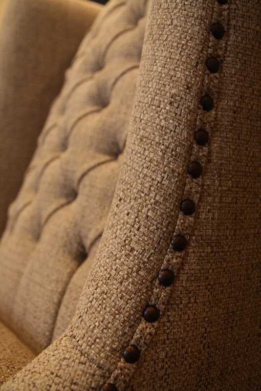
Nailheads and tufting. Love, love.

I simply adore these mercury glass mushrooms I placed under a cloche. I've
previously talked about using
mercury glass here.


The accessories on the cocktail table. I found this sweet little shadow box and filled it with faux mossy rocks and some shells from one of the family's beach vacations.
I hope you've enjoyed a peek into my client's home and one of my projects.
A very big thank you to the Jacksons. You are lovely, gracious and a joy to work with. I can't wait to work on the next space we've got lined up :-)
Happy Hump-Day!


 I glued the grosgrain ribbon to the


 In the before image, you can see another angle and a little more of the space.


 Today I've got a little sneak peek into a small project I've been working on.


