Tuesday, October 27, 2009

Industrial Chic

I have long been a fan of furniture with an industrial flair. I believe that my obsession with industrial details began, when I was much younger, with Tim Burton movies (think Edward Scissorhands). I love nailheads, metal rivets, oversized steel casters, pulleys and salvaged wood. There is something raw and historically preserved about these details. I've been noticing many of these elements emerging into the mainstream design industry. Many designers have been incorporating this look into their designs and furniture collections lately.

Most recently, I was pleasantly surprised when I received my new holiday 09 Restoration Hardware catalog. I just about jumped with joy to see their new look. They have joined the industrial bandwagon. Mixing these vintage pieces in a traditional or transitional environment is what I would term "industrial chic". This is also a really hip way to go green. Using salvaged materials and repurposing vintage furniture is one of the best ways to minimize your footprint when it comes to interior design.
Take a look at what Restoration Hardware has in store for us this season...

A vintage-inspired early 20th century French drafting table paired with a draftsman's industrial steel chair.

An early 1900's industrial furniture cart original, made and refurbished in the USA. No two of these tables are exactly alike. Perfect!


A reproduction 19th century pharmacy cabinet.

I recently purchased an antique wood barrister bookcase for only $20 that I found in an old furniture supply warehouse. I plan to paint it and use it much like the pharmacy cabinet above. I'll keep you posted on it's remodel when I get the time to tackle that project.

This desk is crafted from solid reclaimed elm doors.

Solid reclaimed elm door dining table with industrial cast iron bracing.

This island is manufactured from 100 year old pine timbers that were reclaimed from buildings in Great Britain. I'm loving the vintage barstools! They are a perfect reproduction.


Reclaimed wood bookshelf on iron casters.

This piece is especially dear to my heart. Printmaker's cabinets are a staple at any architectural firm. They generally house maps, prints, drafting plans and the like. Restoration Hardware's is actually a sideboard made to look like a vintage printmaker's cabinet. I, of course, can't overlook the cast-brass bin pulls, which are another personal favorite. I love it!
Here are some more pieces that are true antiques that I have found for sale online.


I'm a bit obsessed with this piece. I've been wanting a bar cart for a reeeeeally long time and this one is so cool, I can hardly stand it!


This antique card catalog would be delightful as a jewelry box! I would stash my scarves and such in those two bottom drawers and maybe line up my clutches in the overhead cabinets. Lovely!
Antique tool box.
Industrial steel task chair.
Wow! I love the cast iron gear base on this table married to the distressed wood top. This table would look so cool paired with Os Du Mouton chairs upholstered in burlap and adorned with large antique pewter nailheads.
Antique dentist's cabinet. This is another piece that I might just be a teency bit obsessed with.
The hostess station at the new Tavern LA restaurant. There are many industrial chic elements throughout the fabulous design of this hip new restaurant, you should click the link above and check it out.
Be on the look out for industrial inspired designs, I have a feeling that you are going to be seeing a lot more of them.

Thursday, October 22, 2009

Ace in the Hole


I came across the Ace Hotel in Midtown Manhattan in one of my design publications and I just had to share. The design is whimsical and edgy...part old schoolhouse laboratory with a dash of punk. My interior design background began in hospitality design and nothing about this hotel fits into the hospitality design cliche, which I love. This masterpiece is the product of a husband and wife team, Robin Standefer and Stephen Alesch, who together own the design firm Roman and Williams Buildings and Interiors. Their Ace Hotel project is by far one of the most original designs for hospitality I have ever seen!
Be sure to click on the photos to expand in your browser window...there are tons of fun and unexpected details you don't want to miss.
This is the lobby, need I say more? Can't you just hear Social Distortion crackling from an old amp?!
Check out the Greek key mosaic on the floor, the schoolhouse globe pendants and the old slate laboratory tables that were salvaged, wired for lights and given a hip new life. There is even a vintage photo booth!
Standefer describes the lobby as "a combination of a grand European hotel and a big, awesome living room". I love all the vintage finds...antique apothecary cases and jars, taxidermy, old schoolhouse chairs and old commercial signage.
I just purchased some of the antique apothecary jars on top of the 19th century taxidermy cabinet (to the right) and I was so excited to see them used here. The walnut herringbone floors are incredible!

Old laboratory cabinets and a terrarium.
Vintage chair reupholstered in wool plaid and a big black X painted on the back. A vintage blackened-steel apple bin in front of reclaimed oak paneling. Old magazine pages collaged into a cabinet in the reception area. I love all of the materials that were repurposed...good job on being cool and green.
Michael Anderson, an artist, used more than 5,000 copies of graffiti stickers for the collage mural along the staircase up to the mezzanine.

The Breslin Bar and Dining Room. You will also find Stumptown Coffee Roasters set up right in the lobby.
This guest bath looks like an old NY apartment. A reclaimed desk, vintage refrigerator and an antique soda box that houses mini bar treats.
One of the guest rooms. Brilliant art! Anyone else sick of seeing meaningless floral still lifes and bucolic compositions on hotel walls??...I am!!
The guest rooms are eclectic and fun. They are reminiscent of an old apartment, or a rocker's digs. Don't be surprised to find guitars, turn-tables and old vinyl records strewn about as part of the aesthetic.
Guest hangers adorned with and oh-so-clever stamp hanging on powder coated plumbing pipe.

How cool is this hotel!?!

On my next trip to New York I'm definitely checking in!


images and information from Interior Design magazine

Tuesday, October 20, 2009

Città del Vaticano


Bella Italia: Terza Parte. Vatican City.
Opulent. Venerational. Spectacular. It is hard to put what I saw into words, but these are just a few that come to mind.
The history and reverence within the walls is truly humbling. I was raised in the Catholic church, and even though I am now a non-denominational Christian, being surrounded by the deep, rich, Catholic history was warm, familiar and comforting. The deep respect that Catholics have for their religion and their beliefs permeates the ancient structures.
From the minute you walk into St. Peter's Sqaure, (seen above) you can't help but feel the immense colonnade symbolically welcome you in with open arms. The square, designed by Bernini, is vast and the scale alone of everything that you are about to encounter is hard to wrap your mind around.

The top floor of this beautiful building are the pope's private quarters.

The Bernini Bee was moulded, stamped, painted...you name it, on most of the art, sculpture and buildings in Vatican city.
Priests.

Papal Swiss Guards in uniform. Disciplined and loyal, they are the only Swiss Guard that still exist today.
When we entered St. Peter's Basilica there was phenomenal sunlight beaming through the transoms in the dome. If you stood just right it would give you an angelic glow.
Frank and Perry's rendition of the Creation of Adam.....
and then we were all struck by lightening, ha.

Michelangelo's famous Pieta. You can't get close to this anymore because some crazy person came into St. Peter's and started hacking at this amazing sculpture with some sort of a hammer. It now sits about ten feet behind bullet proof glass.

Frank and I inside St. Peter's
Marble carvings.

Ornate floor grate with the crypt below that houses St. Peter's tomb.

The angel of death. The marble, so intricately carved to represent fabric folds, covers the angels head, while a gold hourglass is gripped by it's boney hand. Creepy but still beautiful.


The most amazing trompe l'oel I've ever seen!


Pure opulence.


Tutti.


Marble busts along a corridor.

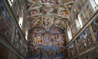
Then we came to the Sistine Chapel. I had the biggest lump in my throat when I was waiting to enter. The minute I set foot inside, my head was spinning and tears were running down my cheeks before I could even attempt to control my emotions. My eyes were darting back and forth, trying to take in the paintings that I have gazed at my whole life in art books. I felt like I couldn't breathe.
The chapel is much smaller that you would expect. It is also full of people and very quiet, because you aren't allowed to speak. This adds so much to the experience. You are standing in a room packed full of people, no one is speaking and everyone, I mean everyone, is in awe. This is just one of those things that I'm not going to try to explain any further than that. I wouldn't do it justice. You just have to see it for yourself.
You are also not allowed to take pictures. I followed that rule well. Seriously, like I'm not going to take a picture...it's the Sistine Chapel for crying out loud.
Frank and I...breakin' the law, breakin' the law...


On our way out we mailed ourselves postcards. When I received it in the mail it was pristine. Not a speck of dirt and no messy postmarks...frankly, it looks like I never mailed it, just put a stamp on it and hung on to it. However, it was special and fun to receive mail from the Vatican.
Our day at the Vatican imprinted the most memorable images into my brain that I will take with me for the rest of my life. It is truly something to see.