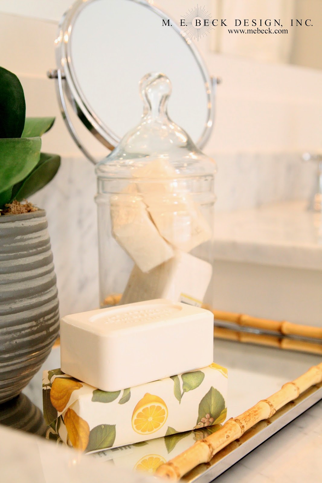
 This lovely bath is part of a total home project I've been working on from the beginning of construction. It is a true Center Hall Colonial style home from the Colonial Revival Style and it, along with it's owners, have been a joy! I love this period and style of architecture and there is nothing better for a designer than to work on something that she would love to have for herself!
We wanted to respect the integrity of the architecture by selecting most materials and finishes that were indicative of the style and period. There are several French influences throughout the home as well, which appeals to the lady of the house. I think that these have worked beautifully together.
I designed the vanity wall, above, with faux columns and arched recessed mirrors flanked by sconces with a beautifully aged (forced of course, as these are reproduction) silver patina. This division of the mirrors is so much more appealing than the 'wall-of-mirror' that so many builders resort to these days. If you have the 'wall-of-mirror' in your bath, don't feel bad, I do too (I didn't select it, it was in our home when we bought it). If tearing it down isn't an option try hanging a decorative framed mirror on top of it (which is what I did). This simple solution works wonders!

Notice the French inspired chandy above the tub. It works beautifully within the space, along with the French inspired, functional, buffalo check drapery panels.


I have absolutely loved working with this darling family! I can't wait to show you what we have done :-)
I hope you're getting a great start to the week!
*due to client contracts, I am unable to share sources*


9 comments:
I love this bathroom!!!! So classic yet modern and fresh. Those curtains are gorgeous!
Thanks so much Tara! :-)
It looks gorgeous! What fabric did you use for the windows?
Thank you C n A! Unfortunately I am unable to source my contracted projects. Thanks for taking the time to leave a comment :-)
So pretty! I was wondering if you could tell me the width of the vanity? I would like to include a knee space area between our sinks but I wasn't sure if we have enough room. Thanks!
Where did you purchase the mirrors?
I would also love to know the length of the vanity please!
The cabinets are white? They look tan or off white in the photo but it could be because I’m on my phone.
This bathroom is beautifully designed and decorated.
Post a Comment