

Well, here she is in all her glory...and glorious she is, in my humble opinion.
Take a look at what this kitchen looked like before.
The before kitchen was actually very nice, it just needed a little updating.
Take a look at what this kitchen looked like before.

The before kitchen was actually very nice, it just needed a little updating.
This home is very old and is located in a very old, charming neighborhood in San Antonio, however the existing kitchen was part of an addition that was added sometime in the early 90s I believe. We wanted our updates to feel vintage and respect the integrity of the era of the home.

We kept most of the layout the same but made it a little more functional for this large family. They have 5 teenage kiddos!!! One of the main requests was to increase the size of the island to make it more functional for not only the large family but also their kid's sports and church functions that they often host.
You can see in this before image, below, that the cooktop and bar sink compromised most of the island, which made the usable counter space very limited.

Well, not anymore! Take a look at the size of that island! That is one single slab of soapstone too!
Another update, that you will notice, is the cabinets were taken all the way up to the ceiling. I do this on every project that I am able too. It draws your eyes up and takes advantage of the ceiling height with even the lowest of ceilings. It also maximizes storage by filling in the awkward furdown space that ultimately will need decorating, and dusting of said decor, if left open.

The kitchen appears larger because it actually is. In the before image above and below you can see a wall (with windows) to the right. This was an awkward sun room type area that separated the old home from the new 90's addition. The windows looked into a bricked-in room, which was kind of strange. We opened that space up and made it part of the new kitchen with a beautiful cased opening into the old dining room, that they didn't have access to from this space before.

In the image below, you can see where we took the little room out and made it part of the kitchen.
Notice the pretty, new chandy in the dining room. I can't show you that space yet because it isn't complete :-)

Isn't the soapstone yummy?!
In this before image below, you can see the old sun room space to the left and the nook straight ahead.

We removed much of the colonial detailing as it didn't really fit the style of the home anyway, and replaced it with cleaner lined millwork.
We opened up the wall to the right as well, which made a bar area that is open to the family room, with a lighted bridge of cabinetry overhead. The removal of these walls was dramatic to the space and helped it not feel so compartmentalized. Now, when you are in the kitchen, you won't feel disconnected from whatever is going on in the family room.

Here's the new Wolf range and vent.
We used calcutta gold on the backsplash and installed a herringbone detail over the range.


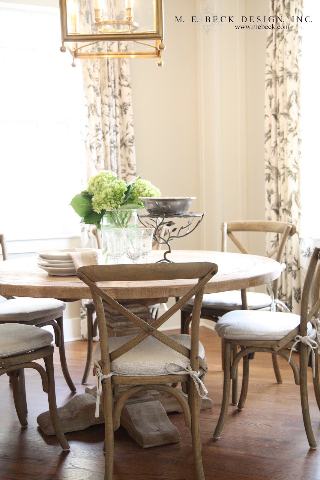
The pretty eating nook.


If you haven't already noticed, take note of our hardware placement. We wanted the bin pulls to actually look like they were on bins, so we positioned the hardware on the top rail, just like a vintage bin would be.

The client and I wanted the pantry to feel like a mini general store, complete with beadboard backing on the shelves. We hung a vintage inspired schoolhouse fixture in there to complete the aesthetic. I love this little space!

It's all in the details...

I don't think I could be more obsessed than I am with the fixture over the island by Visual Comfort!


We kept most of the layout the same but made it a little more functional for this large family. They have 5 teenage kiddos!!! One of the main requests was to increase the size of the island to make it more functional for not only the large family but also their kid's sports and church functions that they often host.
You can see in this before image, below, that the cooktop and bar sink compromised most of the island, which made the usable counter space very limited.

Well, not anymore! Take a look at the size of that island! That is one single slab of soapstone too!
Another update, that you will notice, is the cabinets were taken all the way up to the ceiling. I do this on every project that I am able too. It draws your eyes up and takes advantage of the ceiling height with even the lowest of ceilings. It also maximizes storage by filling in the awkward furdown space that ultimately will need decorating, and dusting of said decor, if left open.

The kitchen appears larger because it actually is. In the before image above and below you can see a wall (with windows) to the right. This was an awkward sun room type area that separated the old home from the new 90's addition. The windows looked into a bricked-in room, which was kind of strange. We opened that space up and made it part of the new kitchen with a beautiful cased opening into the old dining room, that they didn't have access to from this space before.

In the image below, you can see where we took the little room out and made it part of the kitchen.
Notice the pretty, new chandy in the dining room. I can't show you that space yet because it isn't complete :-)

Isn't the soapstone yummy?!
In this before image below, you can see the old sun room space to the left and the nook straight ahead.

We removed much of the colonial detailing as it didn't really fit the style of the home anyway, and replaced it with cleaner lined millwork.
We opened up the wall to the right as well, which made a bar area that is open to the family room, with a lighted bridge of cabinetry overhead. The removal of these walls was dramatic to the space and helped it not feel so compartmentalized. Now, when you are in the kitchen, you won't feel disconnected from whatever is going on in the family room.

Here's the new Wolf range and vent.
We used calcutta gold on the backsplash and installed a herringbone detail over the range.


The pretty eating nook.

If you haven't already noticed, take note of our hardware placement. We wanted the bin pulls to actually look like they were on bins, so we positioned the hardware on the top rail, just like a vintage bin would be.

The client and I wanted the pantry to feel like a mini general store, complete with beadboard backing on the shelves. We hung a vintage inspired schoolhouse fixture in there to complete the aesthetic. I love this little space!

It's all in the details...

I don't think I could be more obsessed than I am with the fixture over the island by Visual Comfort!

And just to fill your design tummy a little more...
Here is a little sneak peek of the family room.
This is the before image below.


All that I can show you right now is the fireplace makeover because this space isn't complete yet either, but isn't this lovely?!


I completely redesigned the millwork and removed the colonial details and dated, shiny brass. We brought the calcutta gold marble to the surround, which establishes continuity with the kitchen, since these spaces now interact with one another.
This color palette makes me very, very happy!


I hope you've enjoyed seeing this lovely remodel as much as I did working on it!
I would like to give a special thanks to the Peoples family. You are gracious, funny and kind. You were absolutely delightful to work with!!!
I would also like to thank Shelly Home Company for another successful project collaboration!
I hope you're having a great start to the week!
*due to client contracts, I am unable to share sources*


398 comments:
1 – 200 of 398 Newer› Newest»Gorgeous! Love that fireplace!
Thank you Jean, and thanks for reading :-)
Perfection!! Your design is beautiful and love the fireplace facelift. Thanks for sharing!
Maureen
Gorgeous as always, Maria!
Thank you mom of 2 cuties :-)
Thanks Alli :-) xoxo
Wow! That is one stunning kitchen! Great work!
Thanks Janna! Thanks for reading :-)
I am so inspired by your work, and absolutely love your blog! Some of the transformations are just unbelievable!! I couldn't help myself - I had to feature you today at http://www.cuphalffull-sf.blogspot.com/
Can't wait to see your work to come!
-Becky
Thank you so much Becky! I'm going to go on over to your blog and check it out :-)
Hi Maria, I live in SA and was so excited to find your blog. You are so talented and your work is truly inspiring. I imagine this home is in one of the historic, gorgeous areas of town..can't wait to see more!
Yvette
Thank you Yvette! You are correct :-) Thanks for reading!
Stunning Maria.... you are a very talented designer... love all your work!
Thank you Patrizia :-)
Just found your blog & LOVE LOVE your style! I'm happy to follow!! btw- would you post the paint colors you used? {wall, baseboards, cabinets} I love how fresh everything looks which is a look I am after!! xo nancy elizabeth
Thank you Nancy Elizabeth! Unfortunately, on a contracted project, I am unable to share specific sources like paint colors. I'm sure you understand. Thanks so much for reading and taking the time to leave a comment :-)
LOVE this kitchen
Just found your blog and love it! Love the kitchen project. Could you please tell me are upper cabinets new or did you add to the top of existing ones to take them up to the ceiling? Thanks Starr
Starr, thank you! Everything in the kitchen is new, we took it down to the studs. I have built cabinets on top of existing cabinets before though, see here http://beckdesignblog.blogspot.com/2012/05/adding-little-character_09.html
Thanks for reading :-)
LOVE that fireplace! Could you tell me the color?
Could you please share the fireplace paint color? Amazing renovation!! Thanks!
Julie
Beautiful remake of the fireplace. We live in Pa and are designing our fireplace. Would love to know where you bought the mantel or if it was custom work. Any info would be appreciated. great job!
sallyeschallier@gmail.com
Thanks for stopping by Sally :-) The mantle was entirely custom work. Best of luck with your designs!
Just beautiful! Amazing Work!
I know you are under to contract to not disclose paint colors but I was wondering if the wall color is more a light beige, light greige, or just grey? Internet photos can sometimes read differently then their true color. Thanks so much for the beautiful post
Would love to know the name of the fabric of the bird white and grey curtains and where I can purchase. Any chance you design in Seattle? Thanks so much!
Did you use a stain or paint on the fireplace? I have a beautiful stain, Rustoleum Weathered Grey, that I'd like to use on our wood mantle. Do you think I'd get the same effect?
Hi Rose, thanks for leaving a comment. I would say the walls are greige.
Hello to all who have asked for paint colors and thank you for the compliments! Unfortunately, I am unable to share specific sourcing information due to my contracts. Thanks again for stopping by!
Hi Unknown, We used paint in this project, but you could likely achieve the same effect with the right stain.
Absolutely beautiful. Done so tastefully. Where can I get the dining table and chairs?
What is the height of the box that your fireplace sits on? I built myself a fireplace almost 2 years ago. Believe it or not , but I had never built anything before. I have wanted to attach it to my living room wall every since I finished it, but I came upon a problem. I'm also adding a chair rail to all the wall's in my living room and on the fireplace wall I noticed that the wall switch plates will be in the path of the chair rail. That box or maybe it's called a raiser would solve my problem. Or maybe you could just tell me a good height for my raiser (box). This diy and decorating your house to be your home is all new to me, but I am having the time of my life. I do so enjoy it. Thank you for any guidance you can give me. Oh please let me know if I can tell where I got the tutorial from to build the fireplace. She's an awesome tutorial writer.
Thanks
Janis
I just saw the fireplace on a post by Elements of Style. I'm wondering if the marble is honed or polished on the surround.
Best,
Lianne
Hi Lianne, thanks for stopping by! I used polished marble on the fireplace surround and on the backsplash of the adjoining kitchen. Best of luck with your designs! :-)
Beautiful breakfast nook table! Where was it purchased?
Where can I find those dining room chairs. Perfect for what I'm looking for.
Where can I find those dining room chairs. Perfect for what I'm looking for.
Beautiful pictures of kitchen and home.I liked the idea of mini general store in home and loved the fireplace mantel. Really a great interior designer you are... Good Job..!!
I love the color of the fireplace - I have the same color marble fireplace and I'm looking for a color to pain it...this one will complement the color or our wall perfectly!
What colour is the grey on the fireplace? Very nice.
Beautiful kitchen! I think this is among the most significant information for me. And i am glad reading your article.
Denver Dining Room Furniture
This kitchen is absolutely breathtaking! I love everything about it
Cleveland Chair Furniture
Great post and the kitchen looks lovely. thanks for sharing it.
Kitchen Cabinet Santa Fe
Love the fireplace! What size tile did you use? I like how it looks like a slab of marble!
Amanda
Looking good! Your new kitchen looks amazing than before. I really like the cabinets in your kitchen and chandelier in the dining room, both are looking amazing. Lovely Fireplace!
California Style Kitchen Design
I love the table and chairs you used in the kitchen nook. Who are they from?
The other great thing about open kitchens is just that, it is all open and spacious. Kitchens today are not the utilitarian rooms of days gone by.
Hertfordshire Kitchen Showroom
This is really interesting blog on Modular Kitchen Showroom in Noida, You are a very skilled blogger. I've joined your rss feed and look forward to seeking more of your excellent post. Also, I've shared your web site in my social networks! Thank You!!!
Thank you for sharing this post.good interior designs .if you want another interior designs see this links.
Home Interiors In Chennai
Interior Contractors In Chennai
Wardrobe Designs In Chennai
Home Interiors In Chennai
Kitchen Design In Chennai
Interior Designers In Chennai
Interior Decorators In Chennai
Best Interior Designers In Chennai
Greenline Architects is a team of Best and Experienced Architects who provide a range of consultancy varying from Luxury Homes to Affordable Row Houses, Commercial, Institutional, Interior, Platting and Landscape to Factory and Vastu designing.
Greenline, Facebook, Pintrest, Youtube
Informative and valuable blog, thanks for sharing with us. Y&H Cargo is one of the best Freight Forwarders in Delhi.
Logistics Company in India
Nice blog, visit for Commercial Vehicle Wrap, Caution & Indication Signages and School Bus Painting Services by Kalakutir Pvt Ltd.
Commercial Vehicle Wrap
Lampung
android
lampungservice.com
lampungservice.com
4
321
Agar aap apne husband se pareshan hai or uss se door rhana cahati hai toh aap Talaq lene ki dua ko kijiye aap pati aapko khud ba khud talaq de dega
Get your lost love in 3 days
Dua to get loved one back
I am so inspired by your work, i just love your blog. Thanks for sharing.
Interior Designers in Chennai
Interior Decorators in Chennai
Best Interior Designers in Chennai
Home Interior designers in Chennai
Modular Kitchen in Chennai
This looks absolutely perfect. All these tiny details are made with lot of background knowledge. I like it a lot.
interior designers in chennai
You have made your points in a smart way. I am impressed with how interesting you have been able to present this content. Thanks for sharing a nice information. Do support us
Interior Decorators in Chennai
Residential Interior Designers in Chennai
Interior Design Companies in Bangalore
Interior Decorators in Bangalore
such a nice post thanks for sharing that good thing with us
modular kitchen in delhi
modular kitchen in noida
modular kitchen in gurgaon
modular kitchen manufacturers in delhi
modular kitchen manufacturers in gurgaon
modular kitchen in noida
imported modular kitchen in delhi
modular kitchen ghaziabad
modular kitchen noida
modular kitchen delhi
modular kitchen in mathura
vidmate
These are all amazing...all amazing… but you are missing two really good ones,
Architect Bureau
Thanks for Fantasctic blog and its to much informatic which i never think ..Keep writing and grwoing your self
apostille services in ghaziabad
apostille services in faridabad
apostille services in noida
apostille services in gurgaon
apostille services in delhi
uae embassy attestation in gurgaon
uae embassy attestation in ghaziabad
uae embassy attestation in delhi
uae embassy attestation in faridabad
uae embassy attestation in noida
Thanks for sharing different beautiful kitchen have a look at
Interior designers in chennai
Interior decorators in chennai
Modular kitchen chennai
modular kitchen
kitchen in delhi
modular kitchen in delhi
modular kitchen manufacturers
modular kitchen designs
modular kitchen delhi ncr
modular kitchen new delhi ncr
kitchen in delhi
The tile designs are very nice and this is a very unique content than any other designing blogs in my point of view. Keep updating more in future. We are doing interior designing works. So please do support us.
Best Interior Designers in Chennai
Home Interior Designers in Chennai
Interior Decorators in Chennai
Interior Designers in Chennai
Residential Interior Designers in Chennai
Thanks for sharing the information with us!!
Aditya Athena
Sumadhura Horizon
I am impressed with how interesting you have been able to present this content. Designing a perfect Kitchen is a special art. It requires a lot of hard work and a creative thinking too. Manufacturer has to consider different things while designing a kitchen. It must be a perfect product in every aspect.
kitchen manufacturers in chennai | Interior designers in chennai | Interior decorators in chennai | Modular kitchen chennai | Home interior designers in Chennai | Interior design companies in chennai
Thanks for sharing the information!!
Provident Kenworth
Sumadhura Horizon
Prestige High Fields
Sri Aditya Athena
Agrim Sky Tower
Creative Udaya Cresent
Thnks for sharing the information!!
MPR Urban City
Provident Kenworth
Ramky One Galaxia
Sumadhura Horizon
NCC Urban Gardenia
MPR Urban City
<a href="http://www.sriadityaathena.com/:>Sri Aditya Athena</a>
I would first like to thank the author for coming up with the insightful information every time. People if you are also looking for the GRE Preparation | GMAT coaching in Gurgaon, then reach out to Wisdom Mart.
Thanks for sharing the information with us!!
Homeopathy in sydney
Homeopathic Treatment Sydney
Best kitchen in delhi
I am very impressed after reading this article. This is very helpful for me.
Interior Designers in Chennai
Interior decorators in Chennai
Home Intreior in Chennai
Office Interior in Chennai
great post , thanks for sharing important information.
Architecture Design Company in Rajasthan
Thank you for benefiting from time to focus on this kind of, I feel firmly about it and also really like comprehending far more with this particular subject matter. In case doable, when you get know-how, is it possible to thoughts modernizing your site together with far more details? It’s extremely useful to me
interior decorators in chennai
Modular kitchen in chennai
Dear Author, Firstly I appreciate your effort in sharing such valuable insights and I absolutely agree with the points. Currently I’m looking for the Best Interior Designers in Chennai,With your insights, I think I would be able to choose the best one wisely.
Home Interior Designers in Chennai
Interior Decorators in Chennai
Interior Designers in Chennai
Residential Interior Designers in Chennai
Top Interior Designers in Chennai
Dear Novelist Great Blog! This post gives a better idea. Thanks for sharing useful information. I hope you will share some more content. Please keep sharing! Currently, I’m looking for the best Residential Interior Designers in Chennai, With your insights, I think I would be able to choose the best one wisely
Home Interior Designers in Chennai
Interior Decorators in Chennai
Interior Designers in Chennai
Best Interior Designers in Chennai
Top Interior Designers in Chennai
Thank you so much for the sharing it was useful and very informative. We're leading office interior designers in chennai, we do all interior contract work.
interior designers in chennai
interiors in chennai
interior decorators in chennai
best interior designers in chennai
interior designers in chennai
modular kitchen in chennai
modular kitchen chennai
office interior decorators in chennai
Office contractors interior decorators in Chennai
Office interiors in Chennai
Office interior decorators in Chennai
Office interior contractors in Chennai
Good information Interior Designers in Bangalore | Interior Design Company in Bangalore | Best Interior Designers in Bangalore | Interior Design Companies in Bangalore | Interior Decorators in Bangalore | Interior Design Firms in Bangalore | Home Interior Designers in Bangalore | Home Interior Design Bangalore | Residential Interior Designers in Bangalore | Interior Design Services in Bangalore | Famous Interior Designers in Bangalore | Interior Design Services in Bangalore | House Interior Design in Bangalore | Luxury Interior Designers in Bangalore | Interior Decorators in Bangalore | Top 10 Interior Designers in Bangalore, List of interior designers in Bangalore | Interior Design Consultants in Bangalore
Thanks for providing great information and looking beautiful blog. Best Interior Designer in Bangalore
Truly decent post. I just discovered the blog and wished to say that I've really delighted in browsing the blog entries. Office Furniture Miami
Thank for sharing information
Good Post, I am a big believer in posting comments on sites to let the blog writers know that they ve added something advantageous to the world wide web.
Best Interior Designers
home interiors in chennai
Commercial interior designers in chennai
I found your blog while searching for the updates, I am happy to be here. Very useful content and also easily understandable providing.. Believe me I did wrote an post about tutorials for beginners with reference of your blog.
interior designers in chennai
Great content thanks for sharing this informative blog which provided me technical information keep posting.
Office interior designers in chennai
living room interior designers in chennai
False ceiling interiors designers in chennai
Excellent post!!!. The strategy you have posted on this technology helped me to get into the next level and had lot of information in it.
Pooja room interior desingers in chennai
Hotel Interior desingers in chennai
Hospital interior designers in chennai
Good information Interior Designers in Bangalore | Interior Design Company in Bangalore | Best Interior Designers in Bangalore | Interior Design Companies in Bangalore | Interior Decorators in Bangalore | Interior Design Firms in Bangalore | Home Interior Designers in Bangalore | Best Interior Decorators in Bangalore | Residential Interior Designers in Bangalore | Interior Design Services in Bangalore | Famous Interior Designers in Bangalore | Interior Design Services in Bangalore | House Interior Design in Bangalore | Luxury Interior Designers in Bangalore | Interior Decorators in Bangalore | Top 10 Interior Designers in Bangalore, List of interior designers in Bangalore | Interior Design Consultants in Bangalore
Excellent post!!!. The strategy you have posted on this technology helped me to get into the next level and had lot of information in it.
personlized baby gifts
personlized gifts for her
personlized gifts for him
Your blog is quite helpful to me and I am sure to others too. I appreciate your post, it is usually nice and contains useful information
Elite Elevators offers you the best home lifts in India, UAE, Malaysia, and Australia. Click here to know more: Home elevators
Home elevators Malaysia
Home elevators Melbourne
Home lifts Chennai
Elite elevators are the best home lifts manufacturers in India. ur Home ELevator Elegance cabins blend with your Exterior butand give your home a royal look that you’ve always dreamt about. Click here: Home elevators
Home elevators
Home elevators Melbourne
Home lifts
Hey! Hope you are fine.
Your Kitchen looking so beautiful after renovation and very helpful post for me as a home renovation contractors Toronto. Thanks for this and please keep posting.
Wonderful kitchen. Try Office Furniture Miami.
Thank you very much for providing the valuable information.
Thanks for sharing the infromative article. It is really very valuable Information and helped me to get some nice ideas. Keep doing such great work.
office.com/setup
mcafee.com/activate
Thanks for this quality post.Thumbs Up!!https://retailescaper.com/fr/code-promo/code-promo-vida-xl/
Are you looking for the professionals providing the best kitchen cabinets services near me? Search for the BM2WCabinetsFinishingFlippingLTD.com for the help!
I'm so impressed by your work. The details are brilliant and I'm totally in love with your fireplace decor. We are also a Interior Design Company Singapore offering home, office and commercial interior designs. Glad to see your projects. Thanks for sharing!
Such an interesting and informative piece of guidance imparted by you. I am glad to discover this information here and I am sure that this might be beneficial for us. I have read a similar article related to it which will help you to increase your knowledge about the Luxury Interior Decorator Miami.
Thanks for sharing this post. your post contains interesting info about the desired topic. I really appreciated your content idea. Fell free Checkout my construction company in London
that building houses of all kinds, as well as installs all kinds of necessary accessories.
Such a very interesting post which is i am looking like.
Here i have also some related stuff that i would like to share with visitors about Steel Kitchen Rack For Wall Mount and Vegetable Chopper Cutter and Dicer.
Thanks
New Line Kitchen Design
Bespoke Kitchens
Bespoke Joinery
Our Projects
Kitchen S-Line
Kitchen U-Line
Kitchen R-RS-Line
Great design for office furniture . I really appreciate the working.
Microsoft Office 2020 Torrent is the whole successor to Microsoft office 2020. It had many more suitable and new features that have been there to enable the touch feature of the contact gadgets. This is conceivable with the Microsoft workplace 2020 product key that incorporates the product itself. Also, a touch-enabled device is required to apply any multi-touch functionality.
This is brilliant blog having more information than other about Interior Design Services. Get home interior, office interior, shop interior service within Shivam Interior Decorator in Noida at a reasonable cost.
Microsoft Office user is not an easy task, as there are hundreds of tools in the pack, and it’s not always possible to understand how they all work. And if you take into account the errors that may arise during work, then you cannot do without customer support. But if you have a problem using the version you get through Microsoft Office 2020 torrent, no one will help you.
Microsoft office 2020 torrent
I read this article and found some unique information about the interior design. Shivam Interior in Noida is offering exclusive Kitchen Interior Services within your budget.
Thanks for sharing the article. This post is informative and very much helpful for the interior designing for Home. The detailing given for the kitchen interior designing process is great. Appreciate this.
Interior Designers in Chennai
Best modular kitchen designers in Chennai
Home Interior Designers
Thanks for sharing this post. your post contains interesting info about the desired topic. I really appreciated your content idea. Fell free Checkout my memory foam mattresses small
Thanks for sharing this amazing blog. You doing a really great job.
Interior Designers Services in Faridabad
Bedroom Interior Design services in Faridabad
Modular Kitchens in services Faridabad
Furniture desiging services in Faridabad
Turnkey Interior Designers in Faridabad
Wardrobe Manufacturers services in Faridabad
Corporate Office Interior Designers in Faridabad
Furniture Manufacturers services in Faridabad
dining room Designing services in Faridabad
Office Interior Designers in Faridabad
Restaurant interior design in faridabad
livingroom Interior Design in Faridabad
Construction company in NCR
Wardrobe manufacturers in gurgaon
Wardrobe manufacturers in Noida
Our holistic approach in giving details to every piece and creating an ambience of warmth is deliberate. We understand that after the hustles and bustles of Chennai. You would love to return to a place of warmth and peak hospitality. You may call it your home; we take it our Cake! Why not allow the experts put an icing to the cake, while you sit, watch and wonder at our art of peak mastery of interior decoration. TTop interior designers in Chennai…
best modular kitchen manufacturer in gurgaon
modular kitchen manufacturer in gurgaon
best modular kitchen manufacturer in noida
modular kitchen manufacturers in noida
modular kitchen bangalore
Thanks for sharing such an amazing post with us. I am always searching like this type blog post. I hope I will see again. Best Stone Worktop Showroom in the UK.
I am really happy to say it’s an interesting post to read. I learn new information from your blog about Kitchen and Dining Table and Dining Chairs, you are doing a great job.
Thanks for this in-depth review. I was looking for information about this but didn't get any information what exactly
I am looking for. Fortunately, I come across to your website and it helps to make my decision.
It's really made my day.
Thank you again for this great article.
Extremely informative. I wanted to thank you for this excellent post. I surely enjoyed each little bit of it and I have you bookmarked to check out more new stuff you post in the future.
https://www.lcrenovation.co.uk/
Renovations in Bermondsey
All the Cabinets we've designed have a story and inspiration behind it.
rta kitchen cabinets
best modular kitchen manufacturer in noida
modular kitchen manufacturers in noida
best modular kitchen manufacturer in gurgaon
modular kitchen manufacturer in gurgaon
This is Spacewood Interiors and offering you top class of interiors service in home, office and commercials interiors desgn and decoration.
apple office interior
electrical turnkey contractors in delhi ncr
interior contractor in noida
interior turnkey contractors
turnkey contractor
turnkey contractors
turnkey contractors in delhi
turnkey contractors in delhi ncr
turnkey interior
turnkey interior contractors
turnkey interior contractors in bangalore
turnkey interior contractors in delhi
turnkey interior contractors in delhi ncr
turnkey interior solutions
turnkey interiors
turnkey interiors in inida
turnkey interior contractors in india
top turnkey interior contractors in india
top turnkey projects companies in india
office furniture India
corporate office interior contractor
hospital furniture in India
informative
Best Orthopedic Doctor in Hyderabad
Wow! Amazing designs! I do like your choice of color palette and textures here. Simple yet brilliant. We are a Reliable Interior Designer Singapore offering Creative Interior Design Singapore.
Thanks for sharing the best and very informative article.
Quality Furniture Store in Bergen County NJ
Nice information providing by your article and I would really like to thank for your article it’s really helpful. Regards
https://indusdesignworks.com/online-drafting-services.php
Outsource CAD project
I think this is one of the most significant information for me. And i’m glad reading your article. Virtual office design
I think this is one of the most significant information for me. And i’m glad reading your article. toxic eco friendly
A cover will help to stop the evaporation and loss heat from surface.
sous vide container with lid
This is basiclally a cotainer with safelock. In this container food is packed and container will be sealed with safelock and cooked the food in this container.
best sous vide container
This rack is to seprate food pouches to the maximum portion of the water.It is used to arrange cooking portions along vertically and horizontly to allow circulation and cooking.
sous vide rack
This is a process of vaccum sealed food in a bag and cooked under the water at specific temperature and set the time and temperature according to your needs.
sous vide supreme demi
Thanks for sharing this article! it's an interesting one! I am inspired to read your Article. I want to share about Idea Art which is one of the leading interior design companies in london. They have an expert designer to design luxury homes and villas, hotels, restaurants, resorts, offices, and more. hotel interior design
hotel magazines
wow!what a kitchen i really like these Interior designing in kitchen.I'm also looking for Interior remodeling in Potomac MD in my Kitchen like this.
The spongy center of your Leucocytes bas – Raisons expliquées called the bone marrow, makes blood cells.
Wonderful blog, I gathered more information on the blog.
Elite Elevators Providing Elite Elevators
Residential Home Lifts
Stair Lifts
SUPRA / RPSP
Automatic gates
Nice Article Thanks for sharing this article.
World's Best Home Lifts in Melbourne
Safest Home Lifts in Sydney
H300 Home Lifts
H200 Home Lifts
H100 Home Lifts
This a great post! Thank you for sharing..
Quality Furniture Store in Bergen County NJ
Thanks for Sharing such beautiful information with as. I hope yoy will share some more info about Smart Home. Please keep Sharing!
security camera in uae
green building dubai
industrial automation in dubai
wago connector
I really enjoyed your blog Thanks for sharing such an informative post..!!
Furniture Store in Bergen County NJ
Hey,
Thank you, I appreciate that I am getting a lot of good and reliable information from your post. Thanks for sharing such a kind of wonderful post about Custom Built Fittings.
Hindi Quotes Thoughts Suvichar in Hindi
Hi,
Thank you for a very interesting article. I greatly appreciate the time you take to do all the research to put together your posts. I especially enjoyed this one!!
Interior design Company in Delhi
Attractive section of content. I just stumbled upon your website and in accession capital to assert that I get in fact enjoyed account your blog posts. Anyway I'll be subscribing to your feeds and even I achievement you access consistently rapidly.
Lights and Cabinet Look Beautiful. Appreciate Your Efforts in Writing Such a Detailed Article. Thanks for Sharing. Make sure Your read about the Best manufacturer of Modular Kitchen in Kolkata
Great Sharing! For Interior decorations, Contact Interior Decorators In Chennai
woww! Beautiful kitchen designs. keep sharing more.
https://pinkapple.co.in/ one-spot solutions for all space owners. Do visit Today.
Thanks for sharing this beautiful information.I hope you will also share more information.please keep sharing.
P.K. Budget Hotel
Thanks for sharing this great information.
This furniture is very amazing. If you want more information about this furniture, you can visit my site. It will help me a lot.
This is company.This is the Top Interior design company. It is the best interior design company in Dubai. There is the high quality designs in this company.Apamia follows all new trends and styles in 2020.
Wonderful design all kitchen collection and entire looking fantastic. See here complete Kitchen Furniture at easily.
Nice information. Thanks for sharing content and such nice information for me. I hope you will share some more content about. Please keep sharing!
https://www.lcrenovation.co.uk/loft-conversion-in-wimbledon/
House Renovations in Wimbledon
MS Prints one of the pioneers in the field of Best Printing press in Coimbatore, Kavundampalayam. Now we cater Custom online printing services to create professional visiting cards & promotional material. Use our expertise to print unique.
Thank for Sharing this great post.
Outdoor Furniture, Patio Furniture, Garden Furniture
Wonderful blog & good post on kitchen interior.Its really helpful for me, awaiting for more new post. Keep Blogging!
Thanks for sharing such a nice blog on interior designing. DS-Miami is one of the best interior designer in miami.
Wow....Beautiful Designs....I wanted to Thank you for wonderful post...Architecture firms in Chennai
Thanks for sharing...Mosquito Screen Manufacturers in Chennai
Cotton, silk cotton, beds, Pillows Manufacturers in Chennai
Thank you for your article. It will definitely help me a lot...
Furniture Pack
Furniture packages
Thanks for sharing this post. your post contains interesting info about the desired topic. I really appreciated your content idea. We at In Out Green Interiors also provide the residential and commercial interior services in Noida.
Thanks for sharing such great information and creative images of the Kitchen that too explaining the before and after of the kitchen. This is really good work keep it up the good work and motivate us like that certainly.
this blog has really good informative knowledge. thank you for sharing such information.
Quartz Stone Slabs Manufacturers in India
We are the best maple design vinyl flooring tiles provider.
"Greetings! Very useful advice within this article! It is the little changes that will make the biggest changes. Many thanks for sharing!"
Lifts Installation & Modification Services in Ghaziabad
Lifts Installation & Modification Services in Delhi NCR
Are you looking for Interior designers in chennai? Best interior designers in chennai with a team that can create alluring and innovative designs for home and residential at an affordable cost. Get your free quote here.
http://www.venzahomedecorss.com/
Thanks for posting this informative things to people. This is really helpful for readers.
Designer Cabins Manufacturers in Ghaziabad
Designer Cabins Manufacturers in Delhi NCR
Hi,
Thank you for a very interesting article. I greatly appreciate the time you take to do all the research to put together your posts. I especially enjoyed this one!!
Modular Kitchen Design in Pitampura
Modular Kitchen Design in Rohini
Modular Kitchen Design in South Delhi
Delighted to see your blog.
landlord furniture packs
Furniture packages
Nice Kitchen Interior designs...
Hi, This is a wonderfull blog it’s amazing and helpful, i want to see more blog to know more about other things like this because this blog gives me a lot of information, knowledge.
https://indusdesignworks.com/3d-rendering-services.php
Online 3d rendering services
Wow ! Amazing information showing through your blog, it's a beautiful decoration things.Thanks for sharing.
Hotel Furniture Manufacturers in South Delhi
Hotel Furniture Manufacturers in Delhi NCR
Hi,
I just wanted to inform you that Dezign Code is one of the interior designing companies in Bangalore that deals with Commercial, Hospitality, and Residential Interior Designings. Our Interior Designing works are of the highest quality and customizable. Our Designers are expertise with current trends and deliver the Best out of least on-time.
Here you must click to see some of our works;
Visit: https://thedezigncode.com
Local Profile: https://g.page/thedezigncode?gm
Arabic Sweets
Thanks for Sharing the nice post. Looking for the best hotel furniture manufacturers in Delhi NCR. Please check out here.
Thanks for this informative blog, congratulations! keep on doing simple yet attractive designs. For more details Please visit Modular Kitchen Designer in Noida.
The blogs you are producing are the direct service to the world of technology and the sciences because you are incorporating the latest research that is changing the ways of thinking of engineers and scientists. Keep the spirits high. Thumbs up.
wholesale ladies dresses uk
Hi,
Thank you for a very interesting article. I greatly appreciate the time you take to do all the research to put together your posts. I especially enjoyed this one!!
Home and Office Interior Designers
Architecture & Interior Designing Services
Architecture firms in Delhi
Thanks for the blog it was informative.
Storage And Warehouse Racks Suppliers In Qatar
| Shelving & Storage Equipment Supplies In Doha
| Racks And Shelves Doha | Racks And Shelves Doha
Congratulations! keep on doing simple yet attractive designs. this is the best profession. keep on searching new ideas also related to interior & architecture designs.
Best Interior designers in Delhi
Architecture designer in Delhi
Home furniture designers in Delhi
Thanx!
Very useful and beneficial post. Really nice information provided. Thanks for sharing such an informative blog.
At garden machine parts you'll get the top and best rated genuine machine parts. Whether you're looking for repair parts to replace old parts with a new one, we got everything, We have all the needed garden machine parts such as lawn mowers, hedge trimmers, scarifiers, ride on tractors, lawn tractors, tillers, compact tractors, chainsaws, brush cutters, blowers, pole pruners, shredders, chippers, garden machinery, Honda lawn mowers, countax lawn mowers and stihl chainsaws. Buy online garden machine parts direct from our online store, you can find us on the internet by simply typing garden machinery parts near me.
Would love to know where you purchased the drapery on either side of the fireplace
Best App Design & Development Company in Lahore
Best App Design & Development Company in Lahore
ActiveCool Fashion is one of the best clothing manufacturers singapore. Thanks for sharing this kind of information with us.
ActiveCool Fashion is one of the best clothing manufacturers singapore.
Calacatta quartz, Pretty good post. I just stumbled upon your blog and wanted to say that I have really enjoyed reading your blog posts. Any way I'll be subscribing to your feed and I hope you post again soon. Big thanks for the useful info.
Best SEO Company in Dubai
Best SEO Company in Dubai
Best SEO Company in Dubai
Best SEO Company in Dubai
Best SEO Company in Dubai
Thanks for your information.
Reconditioned AGA
I found this one attractive captivating and it should go into my gathering. Very decent work! I am Impressed. We rise that please keep going to write further content. Interior design Dubai Companies
I loved your blog and thanks for publishing this about before after beautiful kitchen!! I am really happy to come across this exceptionally well written content. Thanks for sharing and look for more in future!! Keep doing this inspirational work and share with us.
Find details of companies Supplying Mild Steel, Manufacturing & wholesaling mild steels in India. Get Mild Steel at best price from Mild Steel Retailers, sellers, traders, exporters & wholesalers listed at ExportersIndia.com.
Visit Site:- https://www.exportersindia.com/indian-suppliers/mild-steel.htm
Hello,The post is very stirring and very assumed to be read, may be valuable for the people. I desired to thank you for this great read!!
Interior design Dubai Companies
Great Blog. Extradinary home designs. Thanks for Fantastic blog and its to much informatics which I never think .Keep writing and growing your self. Nice Interior Design.
Click here,
home elevators
Residential elevators
Domestic Lifts
H200 Home Lifts
H100 Home Lifts
Hydraulic Lifts
Post a Comment