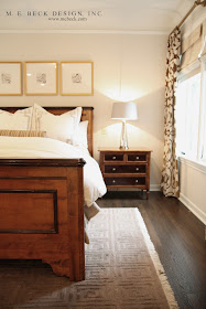
So, if you've been following my little ol' blog, you'll likely remember this gorgeous home from the 1920's that I've been working on for quite a while. I've talked about the dining room, the staircase, the bar, Samantha's bedroom and given some other various glimpses here and there. The project is coming to a close and it is bittersweet, (sweet for the clients I'm sure ;-P) but bittersweet for me. I always feel this way when a project is complete. I take my work very personally, developing relationships that often turn into friendships, with my clients, that it is kind of sad when our work is done. Well, I've definitely grown very attached to this home and the wonderful people that own it!
Because the restoration was so extensive, I really had to get to know this beauty up close and personal. All of her little quirks...the good, the bad and yes, the ugly that needed to go.
The master suite is truly a 'suite'. We knocked down walls and turned a hallway, extra bedroom, a small bathroom, another bedroom and a small sunroom into a to-die-for-suite! The new space is now composed of the master bedroom, an incredible-decked-to-the-nines bathroom, a dreamy walk-in closet and a small study that leads out to a gorgeous new terrace! Yeah, you could basically shut the bedroom doors and live in this part of the house! It's pretty amazing :-)
Below you can see what the space looked like before. Notice the great coved, full plaster ceilings and walls...and the original Maria Theresa chandelier.


So, here is what we did in this part...
We ripped out the dated carpet, replaced the windows (notice the horizontal muntins. love.), added recessed cans (I know many designers have negative feelings toward can lighting, but I don't have a problem with it and I appreciate it's functionality), sent the chandy off to be professionaly restored and we updated the paint.
Then came all of the beautiful furniture and soft goods!
Then came all of the beautiful furniture and soft goods!


Our master bedding concept sketch before ordering fabrics and sending off to the workroom.

Fun detail on the inside of the lampshade of the mercury glass bedside lamps (which are now hardwired to wall switches just an arms reach away from the pillow).

Below you can view the floorplan. This should help you view our changes in this section of the home.

In this before image above, you can see the old hallway and landing. The hallway entrance was sealed up and the new entrance to the master is on the wall to the left where the console is sitting.

The double doors are now where the black console was sitting in the before picture above. The black and white photo gallery wall is where the old hallway was.

The niche that is now the new entrance to the suite was once the old master closet, as seen in the before image below.

In the 'before' image below you can see the other side of the space where most of our construction took place.

This is the 'After' from the same angle.
The opening that you see on the left is a good visual reference since that did not change. We removed the large oak closet system and donated it to Habitat for Humanity. The wall that it was on was moved forward into the room to create the entrance to the new bathroom and closet.

Peek in there and check out that gorgeous new bathroom.
I can't wait to show you that!
I can't wait to show you that!

More on the master suite to come...
I hope you're having a great week!
*Due to client contracts I am unable to share sources*


love the detail on the pillows! so pretty!
ReplyDeleteIt's beautiful! I love your work, Maria.
ReplyDeleteLove this room! What's the color on the walls?
ReplyDeleteThank you everyone!
ReplyDeleteWow! This room is so beautiful. Warm, cozy yet elegant; it reminds me of a classy hotel room. I love those doors to the bathroom. I can't wait to see what you show next with this home. Awesome job, Maria!
ReplyDeleteYvette
Thank you Yvette! :-)
ReplyDeleteLove it...and the curtain fabric. I left you a little award on my blog yesterday:)
ReplyDeleteThank you Fletcher and thank you for the award!!! :-)
ReplyDeleteI love everything!!!!! I just purchased a new home n I'm on love with your wall colors on this house. Could u share your paint choices??
ReplyDeleteThanks you
Amanda
Amornelas08@gmail.com
Maria, gorgeous! And I love the curtain fabric! :) Ann Himoff
ReplyDeleteThanks Annie :-) That fabric comes in lots of pretty colorways...maybe for your master bedroom?
ReplyDeleteAmanda, thank you! I am unable to share sources on client contracted projects. Thanks for reading!
ReplyDeleteWow, what a beautiful transformation Maria. I bet your client was thrilled! x
ReplyDeleteThank you so much Belinda :-)
ReplyDeleteRenovating the design needs extra skills, are you looking to renovate Modular Kitchen Chennai. Then venus is the choice.
ReplyDeleteThanks for sharing these ideas about using marble in interior design. home renovation Switzerland
ReplyDeletekitchen renovation Zurich
luxury villa renovation
bathroom remodeling Geneva
Swiss renovation experts
energy-efficient renovatio