Tuesday, December 29, 2009

Built-In Beauty

This photo is the 'before' of a client's family room.
The armoire houses the media equipment, so the replacement piece that was needed for the space needed to be functional. The armoire was entirely too small for the space and the fabulous ceiling height in this room completely dwarfed the piece. To solve this problem we decided on a built-in that would be a more appropriate scale for the space and also provide some storage.
I drew the specifications for the piece and we had it built.

In this image you can see the finished product. The scale of the piece is now proportional to the room. The additional shelves have added display areas for the couple's objets d'art, that they have collected from trips and such, and the base cabinets now provide storage. The folding doors discreetly conceal the television and equipment, and the corner is no longer an eyesore but a beautiful and functional part of the space.
This corner was part of an overall redo of the family room. The client was tired of the French Provencial look they had in there and they wanted a bright and fresh space.
In this image you can see the 'before'. The palette was very dark and a bit dated.
We removed the valance that was hung right above the windows and took updated, horizontally striped panels to the ceiling, to visually maximize the height of the space. I love to run stripes horizontally (in the industry this is know as 'railroading'). I think that it is an unexpected take on what would be a traditional stripe.
We brightened up the palette, replaced the dated pieces of furniture and painted an accent wall in the background for some interest.
The furniture arrangement worked best for conversation and watching TV, so we kept the concept of the sectional and ran matching sofas in the same pattern.
The client and I are, both, very pleased with the new space and they are enjoying their fresh new family room.
click on images to expand in browser for a closer look

New Designs


Check out M. E. Beck Design, Inc. for some new images of recently completed projects.
There will be more to come in the near future.
Images above - dining room of private residence - Colleyville, TX - recently completed projects

Thursday, December 24, 2009

Oh Night Divine


It is the night of our dear Savior's birth.

Merry Christmas!

How Lovely Are Thy Branches


Happy Christmas Eve!
Images from Martha

Thursday, December 17, 2009

White Winter Hymnal

I'm a bit obsessed with this right now...

Wednesday, December 16, 2009

Snail Mail


This time of year always reminds me of how much I love to get good ol' fashioned, handwritten mail. It truly is a dying form of communication. Christmas cards are one of the few reasons that people still take the time to send traditional mail.
Ok, I'm about to sound really old here. I was home recently and retrieved a bin of things from my old room at my parents house. Inside I found shoe boxes of letters from my friends and family from my freshman year in college. We actually used to write letters to each other! I couldn't help but crack up when in one of the letters my friend states that she has this new thing called "e-mail". Wow, I'm not that old but that just made me sound really old. But, seriously, doesn't it make you feel special when you get handwritten mail?!
I don't send nearly enough handwritten mail, myself, but I do still send handwritten cards and thank you notes. I am actually the proud owner of Papersource's envelope liner template kit.
You can make custom liners for all of your basic envelopes out of fun papers. A basic cream envelope can instantly be funky or personalized. I love details like this! Do you have a Papersource near you? It is such a fabulous store and my head swims with inspiration after just a few minutes in that place! If you haven't ever been in one, check them out here online.
I think that if you have stationery that you think is beautiful you will be encouraged to use it, and since we are in the gift giving season, stationery is a perfect gift. I love to give monogrammed stationery as gifts. I honestly love anything that has been monogrammed but stationery in particular is such an elegant gift! Put some beautiful personalized stationery and a sweet little pen like this one in a fabric gift bag and check that special person off your list.

Another great tip when giving stationery as gifts...put stamps on all of the envelopes. All that your gift recipient has to do is write their sentiments and send them off. Easy peasy!
Send out a little handwritten love!

Friday, December 4, 2009

A Bathing Beauty

I was delighted to open up the winter 2009 Beautiful Homes and see my favorite bathtub! I simply adore the Kohler Vintage Bathtub. Freestanding bathtubs are so romantic and nostalgic. There is something about them that encourages the art of the bath. Taking the time to fill the tub, adding scented oils and relaxing salts, lighting candles...it is almost ceremonial. Then, just sitting in the bath, soaking and reflecting on the day. I can't think of a better way to relax than in an elegant bathtub.

Kohler's clean, sweeping lines are particularly appealing to me. It is updated but still feels very vintage. This tub would make the perfect bathroom centerpiece.
I also love the vintage inspired hardware.

I used this tub on a project several years ago (see pictures below) and haven't been able to get it out of my head since. I don't have the room in my bathroom for a freestanding tub, but if I did, this beauty would be the only contender for the spot.
Here you can see where I used the tub, perfectly nestled in the window alcove. I hung dramatic silk drapes all the way to the ceiling, drawing your eye up to appreciate the ceiling height and back down to the beautiful cast iron focal point.

For my design and color palette, I selected luxurious oil-rubbed bronze hardware. Oil-rubbed bronze is generally my preference for hardware finish. It is a "living finish" and is so wonderful to see the slight variations in the bronze after years of use. I just adore that kind of character.

I surrounded the bathing alcove in gorgeous cream tumbled marble, in different sizes and patterns, to create textural interest, without taking away from the bathtub. This creates a beautiful tub surround while protecting the walls.

Below you can see some other details of this bathroom project.
The cream marble surround was extended to the seamless shower for continuity.

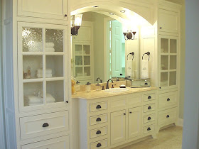
Some views of the stunning millwork. More oil-rubbed bronze hardware, in my favorite bin pull.

Seeded glass cabinet doors allow a glimpse of fresh white towels, bath salt decanters and a beautiful seashell collection.
All of this talk of baths also makes me think of one of my favorite product lines.

Have you used Lollia? If you haven't, you are missing out! Their vintage floral packaging is so lovely and will make you feel feminine just looking at it! I often give little pieces of Lollia as gifts because it is so fabulous! You can find Lollia HERE online, at many boutiques and at Anthropologie to name a few. They have the best handcreme too! It comes in a vintage inspired aluminum tube and leaves your skin, feeling and smelling, so delicious.
Now, I just need to figure out a way to knock down a wall or two to make room for that tub!
...and convince my husband that it is a good idea...hmm.

Thursday, December 3, 2009

Glamorous Rooms


I love, love, love cocktail books. Big, beautiful, hardback cocktail books. I have tons of them... seriously tons! I look for ones in subjects that I love all the time and collect them. I like to place them about my house, under lamps, on shelves, stacked on tables etc. My clients can vouch for this love as well. When I show up for an installation, I generally have an armful of cocktail books to place about.
Well, my new favorite is Glamorous Rooms by Jan Showers. Those of you who live in Dallas, Texas probably know about your extremely talented neighbor. Most everyone in the design industry at least knows her name, and talented she is! I actually have a bit of a design crush on her. Her designs are exactly what the title of the book states...Glamorous! Take a peek at some of the images of Jan's work you will find in this fabulous book.


If you are in Dallas, she has a phenomenal showroom in the design district that is full of antiques, pieces from her collection (like lamps from her factory in Murano...swoon) and inspiring vignettes.
If you love design and beautiful cocktail books as well, this one will not disappoint!

Monday, November 30, 2009

A Simple Sofa Makeover

This sweet little sofa is part of a makeover project that is nearing completion.

I'm a big advocate of using pieces that my clients already have if the pieces work with the design. It's cost effective by freeing up some of the overall project budget to apply to new pieces. This can be tricky though, because you could spend more money redoing something than you would if you just purchased a new piece, so make sure you weigh the options of redoing versus buying new before you spend the time or money. When the piece is worth revamping and when done right, the results can be very rewarding to your design and your wallet.

Here you can see my drawing for the new design of the sofa. It's all in the details! Small changes to this very traditional piece have transformed it into a transitional delight. I removed the skirt and heavy bullion fringe. These two things, alone, cleaned up the lines dramatically. Then I selected new fabric and sent this little baby off to the upholsterer. I changed the traditional pleating on the arms to a classic nailhead detail and replaced the oversized brush fringe pillows with an extra long kidney pillow with contrasting French cord. These details also aided in cleaning up the lines.
The value in redoing existing pieces extends further than just saving money, you will also have a custom piece of furniture that no one else has.
Don't skimp on the details. Here you can see a close up of the nailhead work. Adding custom touches like this make all the difference in the world!

You might have a really cool piece of furniture hiding under ugly fabric, dated finishes or boring details, so, take a look around at your old pieces and try to envision them in a new light.
Once this project is complete I will proudly show you the makeover...it is fantastic!
Here is another little sneak peek of this project.
Check back soon!
*click on images for a closer look*

Monday, November 16, 2009

A Lovely Little Redo

I recently received a couple requests to show more before & after rooms. I love to look at before & afters as well, so I completely understand the draw. Here is a recent project that I have completed and would love to share with you.
This is the formal living room of one of my lovely clients. You can see in the before photos that the room was needing some attention. The family wanted to use this room but it was sad and didn't have any direction.

The client inherited a piano from a family member and wanted this room to be it's new home.
We were able to use many of the pieces that the client already owned by giving them a new life with fresh paint and luxurious new fabrics.

On the far wall, I removed the dated tapestry, that was too small for the space, and installed a collage of art. We reupholstered the bench that was in front of the window in a fresh geometric and pulled it up to the piano for a chic new life. The bergere chairs were originally upholstered in a beautiful olivey leather that looked fabulous with the new color palette. However, the dated oak finish made the leather look dull, so we had the chairs painted a sharp satin black and added custom pillows in a gorgeous Robert Allen fabric trimmed with a contrasting French cord.

Notice the old bench in front of the window and the bergere chair not looking quite as fabulous as it does now. The red silk drapes with tassel trim were dark and dated and, frankly, didn't do much for this room.

Simple panels in creamy linen, banded in chocolate linen, adorn the windows and draw the eye up, visually maximizing the wonderful ceiling height in this space. We also added a beautiful hand knotted Persian rug in gold, cream and black. This particular rug, with it's muted colors and soft, worn look, could easily pass as an heirloom. It adds a little patina to the space, which I think every room needs!

This is a closer look at some of the details. The new bench fabric, the bergere chair and new pillow, the fabulous hand knotted rug and just a glimpse of our gallery wall.
You can see how minimal changes to this space have completely transformed it! The client loves her new space and they actually use this room now.
It is a lovely little redo!

Wednesday, November 11, 2009

Kate Spade on One Kings Lane

The always elegant and classic Kate Spade is on One Kings Lane today. Look at some of these timeless dinnerware pieces that are on sale for half the price!
I am seriously loving this quilted flatware!
How amazing is this dragonfly motif? I absolutely love this!
Beautiful bar accessories for a swanky cocktail hour.

She also has New York Gifts on sale as well, like this striking bowl from the Marlborough collection.
Go on over to OKL and check it out. Go quickly though if you are interested, these kind of pieces never last long on there.
If you aren't already a member of OKL, tell 'em I sent you when you are signing up, and hook me up with some referral credits :-)